Brand
Logo, refreshed
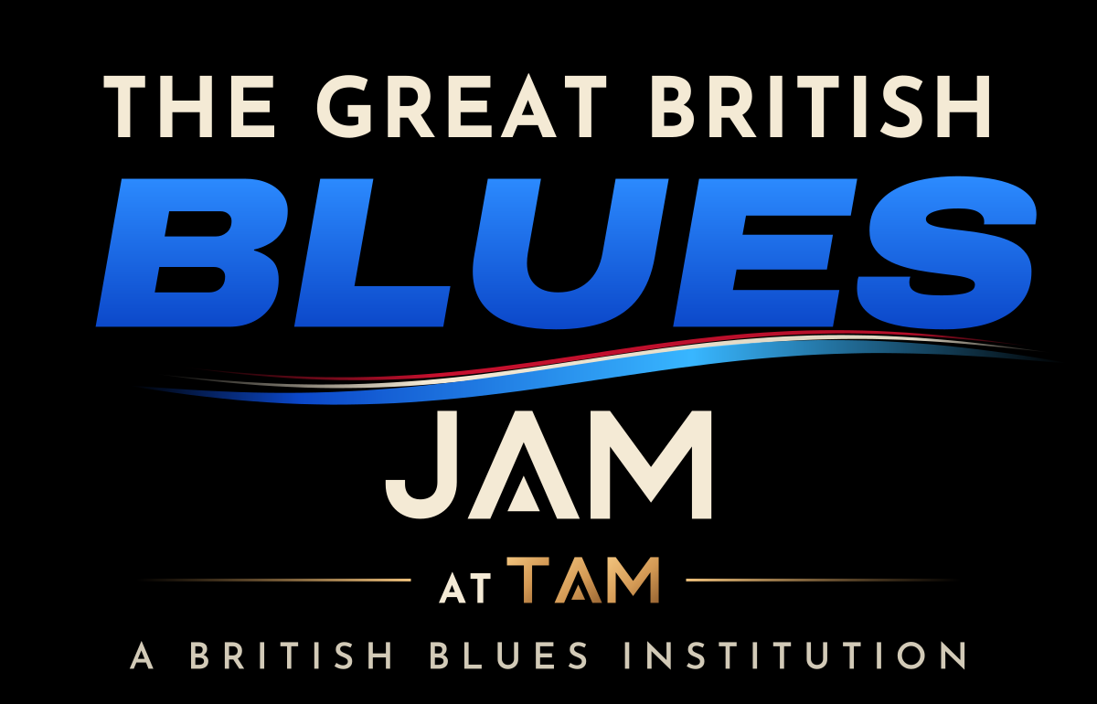
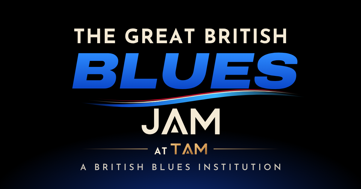
The lockup keeps everything people already know: the blue BLUES, the cream type, the gold TAM, the British nod. Every letter has been rebuilt as clean vector so it holds up from a phone screen to a stage banner.
What was holding it back
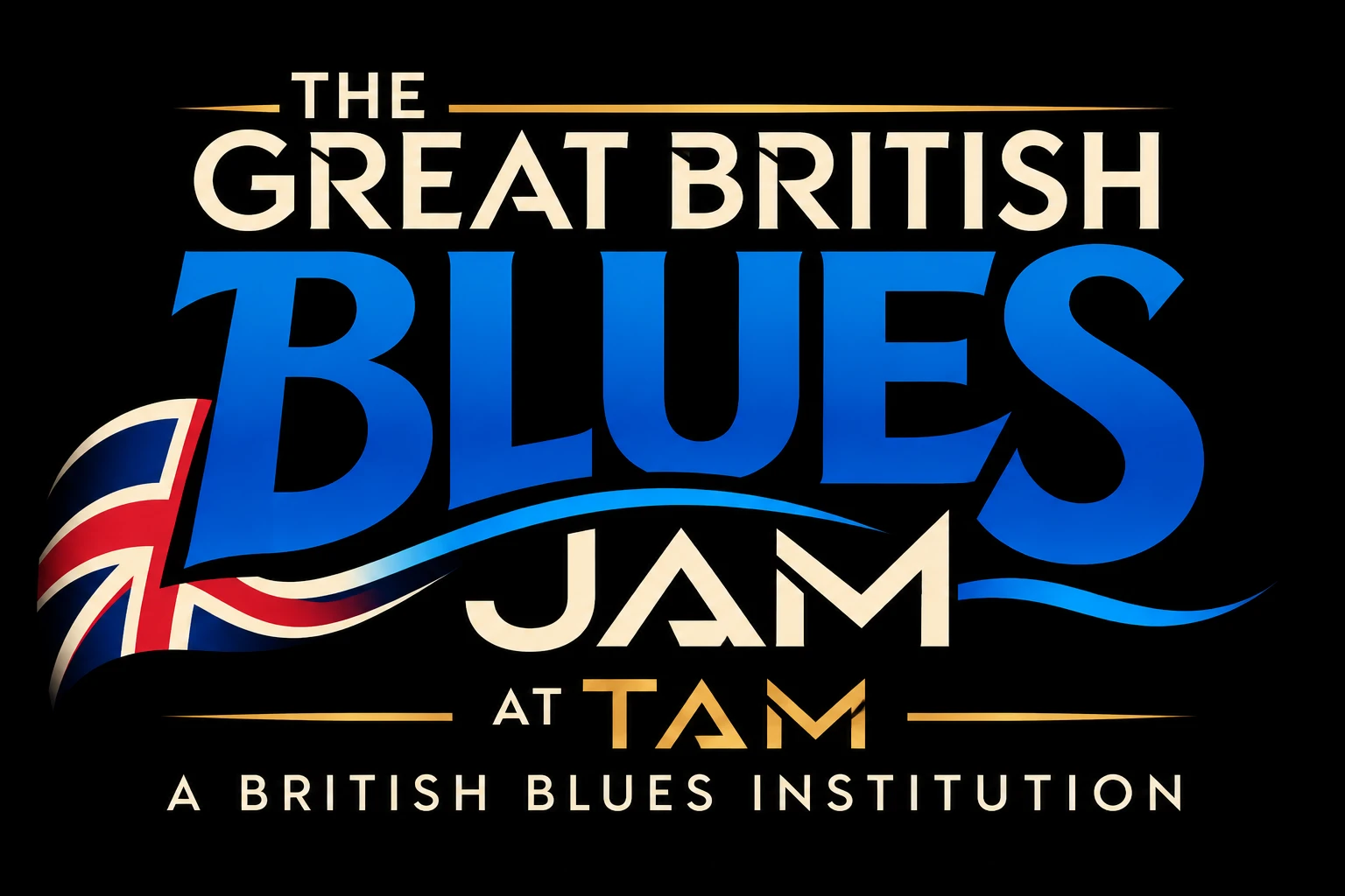
- Raster-only artwork, so it blurs when scaled up for posters, banners or screens.
- Stray slashes and broken strokes inside the letters (the R, E and I of GREAT BRITISH).
- The Union Flag was clipped and inaccurate, and it went muddy at small sizes.
- Seven type tiers competing, so it falls apart as an avatar or favicon.
- "AT TAM" sat apart from TAM's own monogram.
What changed
- Pure vector with all type outlined, so it renders the same everywhere.
- One clean geometric family for the cream type, plus an expanded black italic for BLUES.
- The A in JAM and TAM is drawn from the TAM monogram (open chevron and floating triangle), so the jam visibly belongs to the Temple.
- The flag becomes a red, cream and blue ribbon: the "river" under BLUES. It's still British and still reads at 16px. On the website it's live and moves with the room.
- The header is tightened to five tiers, and there are compact variants for small spaces.
Downloads
Logo files

Colour
Palette
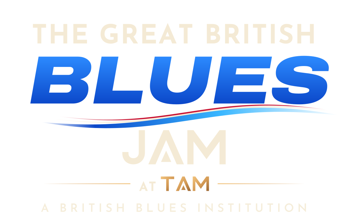
Stage black#000000
Cream#F4EAD5
Blues blue#2C8BFF → #0B47C9
River sky#38B6FF
TAM gold#F2C47E → #9A6633
Union red#C8102E
Type: Archivo Expanded Black Italic for BLUES and big numerals, Josefin Sans Bold for display caps, Archivo for body copy. Custom TAM-family letters (J, A, M, T) are used only in "JAM" and "TAM".